Core Framework Style Guide

core.bricksmaven.com

This style gives you an overview of the current styles and standards for the core.bricksmaven.com website.

Download template
core-hero-image

Typography

An overview of headings and body text type scale and styles

Headings
Body text

H1(--text-4xl)

    Heading 1 Regular

    Heading 1 Medium

    Heading 1 Bold

H2(--text-3xl)

    Heading 2 Regular

    Heading 2 Medium

    Heading 2 Bold

H3(--text-2xl)

    Heading 3 Regular

    Heading 3 Medium

    Heading 3 Bold

H4(--text-xl)

    Heading 4 Regular

    Heading 4 Medium

    Heading 4 Bold

H5(--text-l)

    Heading 5 Regular
    Heading 5 Medium
    Heading 5 Bold

H6(--text-m)

    Heading 6 Regular
    Heading 6 Medium
    Heading 6 Bold

Body Text(--text-m)

    Text m Regular

    Text m Medium

    Text m Bold

Small Text(--text-s)

    Text s Regular

    Text s Medium

    Text s Bold

XSmall Text(--text-xs)

    Text xs Regular

    Text xs Medium

    Text xs Bold

Heading Examples

  • This is a H1 Heading with a --text-4xl class

    Here goes your text ... Select any part of your text to access the formatting toolbar.

  • This is a H2 Heading with a --text-3xl class

    Here goes your text ... Select any part of your text to access the formatting toolbar.

  • This is a H3 Heading with a --text-2xl class

    Here goes your text ... Select any part of your text to access the formatting toolbar.

  • This is a H4 Heading with a --text-xl class

    Here goes your text ... Select any part of your text to access the formatting toolbar.

  • This is a H5 Heading with a --text-l class

    Here goes your text ... Select any part of your text to access the formatting toolbar.

  • This is a H6 Heading with a --text-m class

    Here goes your text ... Select any part of your text to access the formatting toolbar.

Color

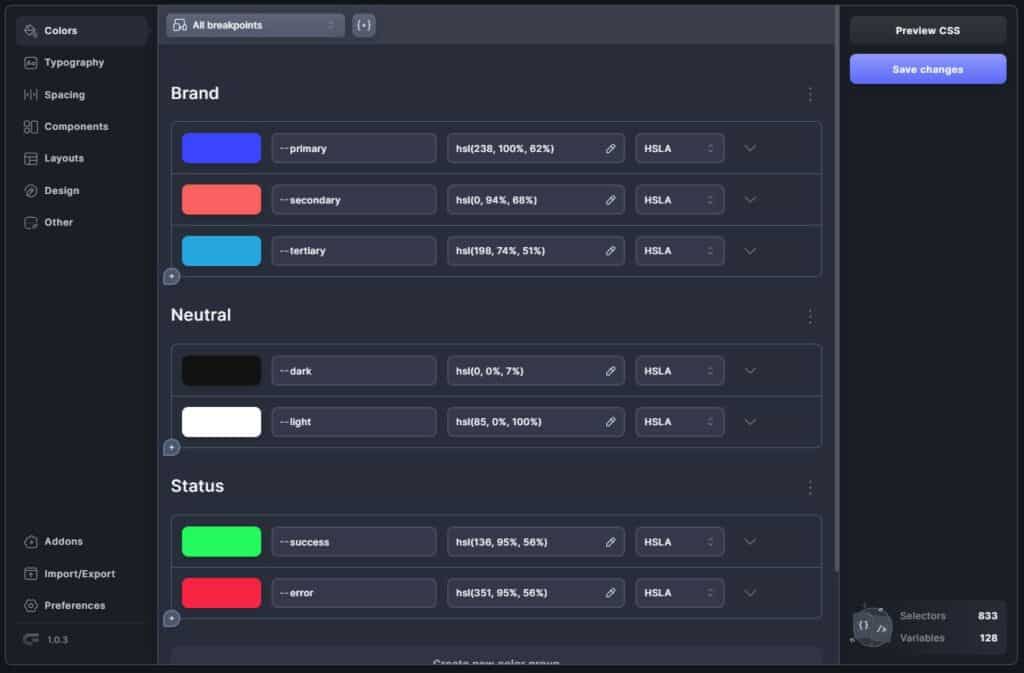
An overview of the brand, neutral and status colors

Brand Primary
Brand Secondary
Brand Tertiary
Neutral Dark
Neutral Light
Status Success
Status Error

Brand

    --primary

Transparencies Variants

    --primary-5
    --primary-20
    --primary-30
    --primary-40
    --primary-50
    --primary-60
    --primary-70
    --primary-80
    --primary-90

Shades

    --primary-d-1
    --primary-d-2
    --primary-d-3
    --primary-d-4
    --primary-d-5
    --primary-d-6
    --primary-d-7
    --primary-d-8
    --primary-d-9

Tints

    --primary-l-1
    --primary-l-2
    --primary-l-3
    --primary-l-4
    --primary-l-5
    --primary-l-6
    --primary-l-7
    --primary-l-8
    --primary-l-9

Brand

    --secondary

Transparencies Variants

    --secondary-5
    --secondary-10
    --secondary-20
    --secondary-30
    --secondary-40
    --secondary-50
    --secondary-60
    --secondary-70
    --secondary-80
    --secondary-90

Shades

    --secondary-d-1
    --secondary-d-2
    --secondary-d-3
    --secondary-d-4
    --secondary-d-5
    --secondary-d-6
    --secondary-d-7
    --secondary-d-8
    --secondary-d-9

Tints

    --secondary-l-1
    --secondary-l-2
    --secondary-l-3
    --secondary-l-4
    --secondary-l-5
    --secondary-l-6
    --secondary-l-7
    --secondary-l-8
    --secondary-l-9

Brand

    --tertiary

Transparencies Variants

    --tertiary-5
    --tertiary-10
    --tertiary-20
    --tertiary-30
    --tertiary-40
    --tertiary-50
    --tertiary-60
    --tertiary-70
    --tertiary-80
    --tertiary-90

Shades

    --tertiary-d-1
    --tertiary-d-2
    --tertiary-d-3
    --tertiary-d-4
    --tertiary-d-5
    --tertiary-d-6
    --tertiary-d-7
    --tertiary-d-8
    --tertiary-d-9

Tints

    --tertiary-l-1
    --tertiary-l-2
    --tertiary-l-3
    --tertiary-l-4
    --tertiary-l-5
    --tertiary-l-6
    --tertiary-l-7
    --tertiary-l-8
    --tertiary-l-9

Brand

    --dark

Transparencies Variants

    --dark-5
    --dark-10
    --dark-20
    --dark-30
    --dark-40
    --dark-50
    --dark-60
    --dark-70
    --dark-80
    --dark-90

Shades

    --dark-d-1
    --dark-d-2
    --dark-d-3
    --dark-d-4
    --dark-d-5
    --dark-d-6
    --dark-d-7
    --dark-d-8
    --dark-d-9

Tints

    --dark-l-1
    --dark-l-2
    --dark-l-3
    --dark-l-4
    --dark-l-5
    --dark-l-6
    --dark-l-7
    --dark-l-8
    --dark-l-9

Brand

    --light

Transparencies Variants

    --light-5
    --light-10
    --light-20
    --light-30
    --light-40
    --light-50
    --light-60
    --light-70
    --light-80
    --light-90

Shades

    --light-d-1
    --light-d-2
    --light-d-3
    --light-d-4
    --light-d-5
    --light-d-6
    --light-d-7
    --light-d-8
    --light-d-9

Tints

    --light-l-1
    --light-l-2
    --light-l-3
    --light-l-4
    --light-l-5
    --light-l-6
    --light-l-7
    --light-l-8
    --light-l-9

Brand

    --success

Transparencies Variants

    --success-5
    --success-10
    --success-20
    --success-30
    --success-40
    --success-50
    --success-60
    --success-70
    --success-80
    --success-90

Brand

    --error

Transparencies Variants

    --error-5
    --error-10
    --error-20
    --error-30
    --error-40
    --error-50
    --error-60
    --error-70
    --error-80
    --error-90

Button

An overview of all the buttons styles and sizes

Button defaultI am a button
Button secondaryI am a button
Button tertiaryI am a button
Button slightI am a button
Button ghostI am a button
Small Button defaultI am a button
Small Button secondaryI am a button
Small Button tertiaryI am a button
Small Button slightI am a button
Small Button ghostI am a button
Large Button defaultI am a button
Large Button secondaryI am a button
Large Button tertiaryI am a button
Large Button slightI am a button
Large Button ghostI am a button

Widths

An overview of all the widths.

max-width-10 (10rem)
max-width-20 (20rem)
max-width-30 (30rem)
max-width-40 (40rem)
max-width-50 (50rem)
max-width-60 (60rem)
max-width-70 (70rem)
max-width-80 (80rem)
max-width-90 (90rem)
max-width-100 (100rem)
max-width-110 (110rem)
max-width-120 (120rem)
max-width-130 (130rem)
max-width-140 (140rem)
full-width (100%)
max-site-width (width:100% / max-width:140rem)

Spacing

An overview of all the available spacing variables available in the default Core framework

  • --space-4xs
  • --space-3xs
  • --space-2xs
  • --space-xs
  • --space-s
  • --space-m
  • --space-l
  • --space-xl
  • --space-2xl
  • --space-3xl
  • --space-4xl
  • Spacing In Action

    An example of all the spacing variables options applied to cards

    • Card with --padding-xs

      Here goes your text ... Select any part of your text to access the formatting toolbar.

    • Card with --padding-s

      Here goes your text ... Select any part of your text to access the formatting toolbar.

    • Card with --padding-m

      Here goes your text ... Select any part of your text to access the formatting toolbar.

    • Card with --padding-l

      Here goes your text ... Select any part of your text to access the formatting toolbar.

    • Card with --padding-xl

      Here goes your text ... Select any part of your text to access the formatting toolbar.

    • Card with --padding-2xl

      Here goes your text ... Select any part of your text to access the formatting toolbar.

    • Card with --padding-3xl

      Here goes your text ... Select any part of your text to access the formatting toolbar.

    • Card with --padding-4xl

      Here goes your text ... Select any part of your text to access the formatting toolbar.

    Box Shadow

    An overview of all the box shadow variables

    --shadow-s
    --shadow-m
    --shadow-l

    Border Radius

    An overview of all the border radius variables

    --radius-xs
    --radius-s
    --radius-m
    --radius-l
    --radius-full